


Share this to


This is the second part of a short series looking at how to implement Gestalt theory. Please read part one first, where we talk about the figure/ground effect. Now, we'll take a look at a couple of other theories that will help you think more about how to effectively communicate a message through your web design and other imagery.
 Gestalt principles are rules that help us to describe how the human eye travels through an image and how we process this information to create order and meaning. Basically, it's a framework for simplifying complex imagery into simple shapes that are easy to understand and then figuring out how these create a unified whole.
Similarity
This is when objects look similar to each other and share characteristics such as shape, texture, colour, size and orientation. Using this basic idea will help us to guide the user of your website where YOU want them to go.
Shape
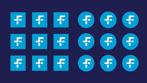
Below is an example of how we group objects into groups based on shape. Pretty much instantly your eye makes the connection of squares vs circles, separating the logos into two groups. We could change the colour, shape or proximity here of each one and the rule would still stand. This is an idea that can definitely help if you've got a webpage with lots of info that you want to break down into sections or categories.
Size
Below is an example of how size can work to trick the eye into grouping objects together. Looking at the image below we can group the circles into 3 groups based on size. It's also interesting to think about hierarchy when using scale, because by making some objects bigger that's generally where the eye is going to go first, followed by the medium sized objects and then the smallest. Again, something that might help when thinking about which information you want to be seen or read first on your site.

Colour
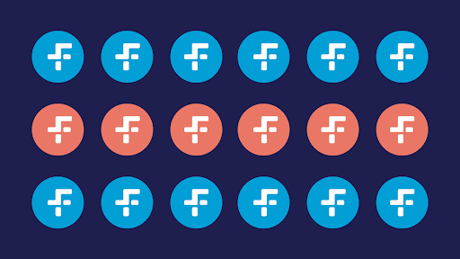
The image below shows us how we can separate objects on a page simply by differentiating the colours. Even if we were to switch up the position of the orange and blue circles to be mixed together, your brain is still going to read them in two groups based on colour alone.
Orientation
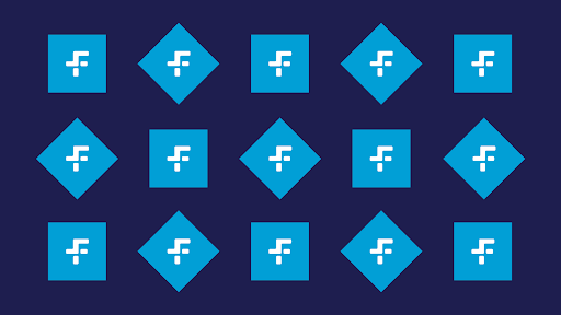
This is another way of grouping objects together or creating contrast between similar shapes. In the image below you'll notice your eye is picking up two different types of shapes, they're the same shape but one set is turned on its side.
The closer the objects are to each other the greater the sense of coherence you'll get. These theories can also be flipped on their head. If we keep all of the objects on a page the same and change only one, this creates contrast and essentially guides the viewer's eye to that area. Something well worth knowing when it comes to designing web pages where you want the user to complete a specific task or head to a certain part of your site.
Thanks for reading! Interested in finding out more? Get in touch, we'd love to talk.


Unleash the power of RevOps
Maximize revenue and sales today.
Begin experiencing faster growth by managing revenue generation cross-functionally. Download the complete guide to RevOps to learn how you can align your teams and scale revenue.
